Tuesday, December 21, 2010

Finishing Sequence


I must say, with all the fretting I have been experiencing as of late, I feel pretty good right now. Being a freelance graphic designer makes me, as the designer, hold myself accountable for everything! That is easier said than done. The rewarding feeling that lingers when I hand a client a finished product that they love makes the process very worthwhile. It also builds valuable knowledge, lessons, and skills that become stronger in the process.

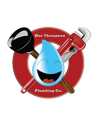
With constant perseverance and a daily "I will finish" attitude I completed my most recent project. It is a logo for a plumbing company called "Doc Thompson Plumbing Co." The original logo drawing was created by talented local Columbus artist, and recent Ohio State University graduate, Jared Lindenau.


Important things that I learned in the process of creating this logo.


I always need to give myself as much time as possible.

As much as I think I can easily create a few sketches from start to finish, it takes time for the creative process to take hold and lead to complete idea formulation. Adding a look and a feel to any project is a challenge. I also need to make sure there is enough time to play around with different design strategies and techniques.

Incorporate the many roles you play into the base price.

Being a freelance designer takes practice. There is a whole lists of hats that it is necessary to wear, including salesperson, artist, designer, bookkeeper, billing agent, customer service representative, secretary, and so on. Those are all time consuming aspects that any one person doing any one of those activities would expect to be compensated for, so why not you? Starting off in my career I have been charging an hourly fee. I feel as though that is slightly off-putting for clients because and hourly fee to them is traveling into the unknown. Now that I have a few projects under my belt, I have familiarized myself with how long they take me while also taking into account all of the different roles I play. That is beginning to allow me to formulate a better hypothesis in how much the total charge is going to be for the clients. Therefore, it allows me to give clients a total price for the project in the very beginning of our working relationship.

Tie inevitable work into the initial price.

During the transfer of this project from the original artist to me, the graphic designer, there ended up being a small amount of confusion that led to a massive amount of work. The artist was personally paid by the client. Henceforth, the artist, Jared, hand transferred the design to me. I assumed that the design was 100% approved by the client. I continued on to scan, vectorize, color, export, and deliver the final product to the client. After completing my task and sending the client the final image, the client the said that a piece of the logo needed to look completely different. Therefore I had to start from scratch on that singular aspect of the logo. In this case, it was the wrench. I ended up redrawing the wrench myself, scanning, vectorizing and reformatting the entire logo to fit the client's needs. Had I met with the client prior to diving into my work, I could have potentially saved the client and myself time and confusion.

Charge a little more for inevitably more.

The opinion that these experiences are assisting in formulating are that it may be a good strategy to quote clients a price that includes one extra reformatting of work to the client's particular tastes and liking. It is very likely to happen. I mean, most drinks at restaurants already have the free refill built into the price whether the customer utilizes it or not. Why not save yourself as the designer the frustration of having to break it to the client that you need more money and look like the good guy when there is no extra fee for a reformatting? Plus, it almost makes up for playing every role in the book.

I fall more and more in love with graphic design every day. It is highly frustrating and challenging yet highly rewarding. I am very thankful for the skill and I would like to send Merry Christmas to you all! Thank you for your support.

What are some ways you charge your clients and how do those work out for you?

Wednesday, July 28, 2010

Always feel at home

It's funny even after I fight myself to death about picking up a pencil some days, once I pick it up I feel right at home.

Tuesday, July 20, 2010

Hot Leads


I graduated from Bradford School in December of 2009. I learned many things in school. One main focus that we had that I found highly valuable is the focus on how to deal with clients. I am still starting out as a designer. I have decided that I have what it takes to be a freelance designer. I am working with any lead I can at this point. I have learned, with nurturing and rapid turnaround, business will boom.

When I first got out of school I had trouble gaining and keeping any clientele. Some things that prevented that were due to the fact that all of my design skills seemed to have faded and also to being burnt out from being in school for such a compact and intense program. I went for the Business of Graphic Design, of which we learned the business aspect last. After I graduated, I had a hard time making myself available to anyone. Since then I have reignited my skill set by meticulously going back through all of my design books.

Now I have confidence. I am working hard on figuring out what to charge per project. This is my skill and my job. First and foremost, I have to make potential clientele realize that so as to not get taken advantage of. Right now, even just working on a few jobs and while I gain more confidence, I am working with a relatively low hourly rate per job. This is helping me work out how long it takes me to do certain types of projects without feeling guilty about potentially taking too much time to do them. Mostly clients seem alright with this method of charging. I must admit, without a static price for the project and the not knowing how long it is actually going to take, seems to make clients slightly apprehensive. Eventually I will start charging per project, but for now I am focusing on my timing.

One last thing that I would like to touch on today is hot leads and rapid turnaround. "I need a business card", "I need a website", "you should draw me a tattoo", ha, I get that last one very often. Apparently, so do other artists that I know. After those prior things have been said I have been working on following it with, "I can do that for you. When is a good time for you to meet up and discuss it". I feel that stops the potential client from drilling you with questions right then and there and leaves you to set a date to meet up and perhaps start an agreement for work. I'm finding that the sooner that you are able, as a freelancer, to set something up with that person, the more likely that it gets done and everyone follows through. Too much time left between an initial meeting and the time that you get around to setting up a sit down meeting allows the initial excitement of the project to fade and doubts to pop up in the clients mind as to whether or not they can afford it. So, the faster that a meeting gets set up and obligations to do work are set the most likely it is that your hot lead will turn into a new client with a solid project. Once you meet and get the specs for the project, it is best to jump on the project and get it done as soon as possible. Within a couple of days if that is possible. Don't listen to clients when they say, "take your time". Taking your time also allows the client to rethink whether or not they actually need the project and many times leads to cancellation of the project.

All in all, make sure that with a lead of initial interest a meeting is set to discuss a project as quick as possible, in the meeting a price and a strategy of payment is set. I am now trying a pay as you go method. Every time I meet with a client, I collect the rate of the work that I have already done. But if you're going with a static fee for a whole project, getting paid in thirds is common. Before leaving the meeting, discuss when you will meet or send the client the final design to approve. Meeting is good, because that will lead to more payment ideally. From the initial meeting, once that project is in your hands, DO IT! Just get it done and it will not have to be thought about until the client approves it! That is the best strategy for reeling in clients, getting paid, and getting more clients, and keeping clients.

Wednesday, June 9, 2010

So much to cover, where to start?


Hello all! Thank you for following me thus far in my artistic mission! So much has happened since last we spoke! Where to start, where to start!? How about we start with Qwirk Co-working premier showing of my art!

Friday, June 4th, I held my first solo showing of my artwork! It was amazing and I am so greatful to everyone that made it happen and came to help me celebrate my artwork and contribute to my cause. It took being in the right place at the right time, seizing opportunities and running with them, and making personal connections.

How it all started is that there is a place here, in Columbus, Ohio called Qwirk Co-working. They opened last summer and I have been looking for a good reason to go there ever since then. It is a place that freelancers can go and utilize their facilities. There is a small fee of $10 if you only want to go for the day or a larger fee to rent out a desk monthly. The have been having free fridays there as of late. The facilities include use of their WI-FI, any open desks or a seat on the couch, their printer, scanner, kitchen, and good company. I found out about them and keep up with them through meetup.com. From time to time they hold free events at their place of operation. On Wednesday, May 5th, I attended an event called Design on a Dime.

To preface the situation slightly, I went in there knowing that there had already been a featured artist in there beforehand. That was a good starting talking point as I was chit chatting with the owner, Neal Roberts and the former right hand woman there, Christy Bernard.

"I'm an artist and graphic designer", I said with as much confidence as I could utter, without having a business card to flash or a website to navigate to. Neal then replied to me,

"We are looking for an artist's work to brighten up the walls around here," or something to that affect. There was my opportunity. I went on to talk about how I had 25 pieces and that they were ready to be shown somewhere. Neal and Christy both said that they would love to see my artwork and asked if I could send them some samples.

"One thing to cross off my to-do list," said Neal, " I was just going to contact some CCAD kids". Immediately, when I got home, I put together a document in InDesign of all of my pieces. I will go into further detail of how I did that in a future post. I had already had scans done of many of them. I immediately sent it off to Qwirk. They replied back within a day or so with,

"Jill, we think your artwork is absolutely beautiful and we would love to have it up here at Qwirk!" They were very flexible with everything. It was nice to be with them through this learning experience because they gave me a lot of leeway. They told me I could come and show to whomever whenever, and to just give them a heads up. They also said that I could have as many receptions as I wanted as long as I cleared the date with them. So, I took it and ran with it! Eventually, after much pondering and indecision, I decided on a date. It took me some time to actually measure the magnatude of the work that was to be done to make this a hit.


After I decided on a date, I made flyers for the event using InDesign and Photoshop. I matted all of my paintings with black matte and lined the back of the matte with strips of foam board. After a tip from Timothy Wolf Starr of the SBB, I also located a local brewer that donated some alcoholic refreshments for the show! Patrick Kelleher of Neil House Brewery was very generous in the spirit of giving when he brought along some freshly brewed stout, a mead, a double cranberry wine, a Pino Gri, and some of his famous cranberry cider. He was a delight as he talked all night about the brewing process and his background of how he became a brewer!

A very special thank you to Melissa Ferguson, Courtney "Tex" Clark, Scott Cheezem, Jeff Walton, Brian Frankart, and Patrick Kelleher for helping me bring together the finer details. Without you, this would have been way harder. Also a special thank you to all of my friends that came out to support me that night, especially CLOUDHAUS! And, of course, thank you for my special glitch-hop set at Hal & Al's from The Beat Oracle! It couldn't have gone off so smashingly without you all!

The show was really what I made of it. An opportunity presented itself and I ran with it. As many fliers as I made and put out at random store windows and coffee shops, 98% of the attendees were those that I had a prior personal connection with. The other 2% were brought in by those people. Just some promotional side studies for you. We also made money for several charities that night, too! I still have yet to tally that up! And I had a raffle for the two posters that I had gotten as a bonus from DKM Printing (thank you Jeff). All in all it was a great success and I have made many new friends and strengthened relationships with old because of it.


Friday, January 29, 2010

Illustrator Need to Knows


Being a Graphic Designer means constantly learning new skills and refreshing old ones. I have been taking the time recently to brush up on my Adobe Illustrator skills. For me, that has meant going back through my book that I originally learned from( Adobe Illustrator CS3: Classroom in a Book) and scouring the interwebs to refresh old tricks, like from these blogs for beginners, such as the Illustrator Beginner's Series from our friends at Illustration Info, and hunt for new tricks, like from this set of tutorials for the slightly intermediate, at klethegr8. Yesterday I renewed the knowledge of how and when to use the Object tool called Flatten Transparency. I would like to share my renewed knowledge of this tool with you.

The Flatten Transparency tool will convert any stroke from a line into an object with a fill and a stroke. Convertible objects also include dotted/dashed lines and brush strokes. The stroke could be drawn with many tools, including the pen, the pencil, and the paintbrush tools.

Make sure you are using the Selection Tool by either finding it at the top of the toolbox as a black arrow or by pressing V on your keyboard.

To use the Flatten Transparency tool, first select the stroke that is desired to be made into an object with a fill and stroke by clicking on it with the left mouse button using the Selection Tool. After the selection has been made, click on Object with the left mouse button from the main menu at the top of the screen and scroll down to and click on the Flatten Transparency option.

When the dialogue box appears, slide the vector bar all the way up to 100% and click on OK. Leave all of the other presets as is for now. The stroke has officially been turned into an object with a stroke and fill.

If you have stray lines within the object, like I did, open the Pathfinder tool panel and click the merge tool. To find the Pathfinder tool, click on Window in the top main menu with the left mouse button. Scroll down to and click on Pathfinder, also with the left mouse button. Once the Pathfinder Tool Panel is open, locate the merge tool at 3rd from the left on the bottom of the Pathfinder tool. Click on it. Any stray lines within the object you just made will disappear.

One way to make sure it is the merge tool, hover over the icon with the mouse and the alt tag will pop up that says Merge.

That is how you turn a stroke into an object with a fill and stroke. I am going to assume from here on in that you have gotten used to how to use the mouse for selecting purposes as well. I hope I have shared some knowledge with you today and thank you for visiting.

What are some of your favorite graphic design tutorials or tricks?

Tuesday, January 26, 2010

Blast Off!

Much enthusiasm crowded the likes of my living room yesterday evening. I was delighted when nine new faces showed up to my "hang out and draw and talk about throwing awesome art/music charity events" meeting. It was elating l to throw around conversation and streams of thought with other like minded, talented artists. Those ideas have been rattling around in my brain for years!

We touched on topics such as what name as an art/music/production/promotion/design company that we would throw events under and what kinds of things we would like to do artwise as a group. I am excited to see what we come up with!

We are off to a great start and will be working hard during the next couple of months to be putting on a show featuring several local electronic music artists, affordable artwork availailable at a pocket friendly price, artists producing live art, and attendee participation artwork as well.

A portion of the artwork that we sell at and after the events will go to support different charities. The first show we will throw will support the victims of the recent Haitian Crisis. I look forward to having a blast while supporting the world!

To those who showed came and conquered the night it was a pleasure meeting you all and I look forward to working with you.(!) And I cannot wait to toss around some artwork next week at ...what hall? See you then!

Thursday, January 21, 2010

My Graphic Design Inspiration


It took me a while to realize that I should be doing graphic design for a living. I did many front covers for orchestra recitals as a high schooler. I did a few concert posters in the short time that I attended my first college. This picture that I cut out of who knows what magazine around that time period of my life has been an inspiration to me as a designer.


What is your most notably inspirational image as an artist or designer?